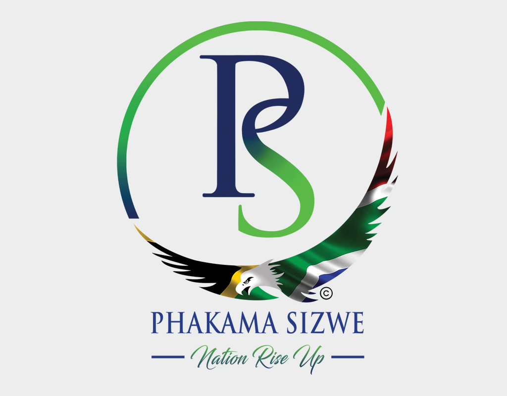
The objective was to empower, encourage and better the lives of people around her – basically making a difference and uplifting people within the community. Phakama Sizwe means nation rise up in Zulu. She wanted to incorporate an eagle in the logo for its associations with inspiration, speed and pride. The eagle is often an emblem for powerful nations. As a proudly South African company, she wanted the South African flag to be included as well. Then we had to feature the colour green as a symbol of growth, harmony, freshness and fertility. (It’s also her favourite colour)
She was looking for a logo that was feminine but strong, and which would be understood across all cultures within the country. She was thrilled with the solution.
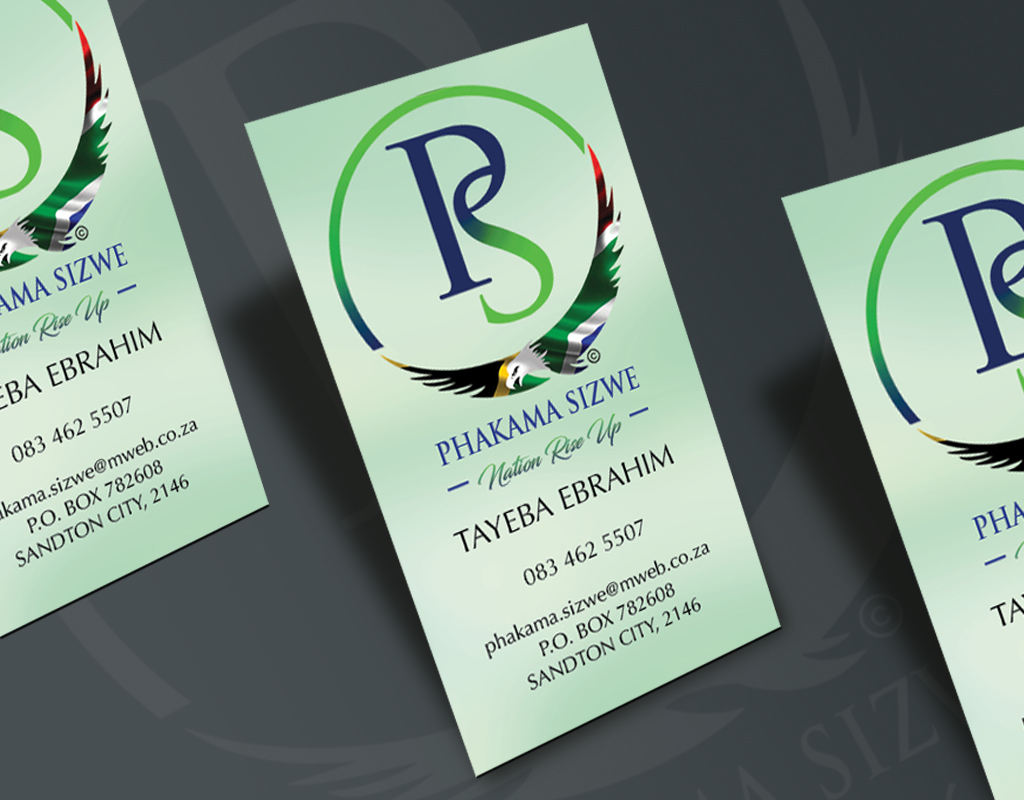
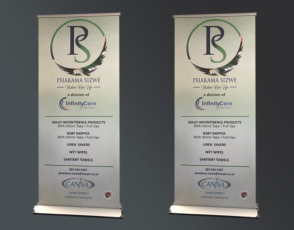
Deliverables: Logo, Calling Cards, Posters, Information Booklets, Pull Up Banners.
Deliverables: Logo, Calling Cards, Posters, Information Booklets, Pull Up Banners .


